Some news makes us particularly proud. This is one of those moments.
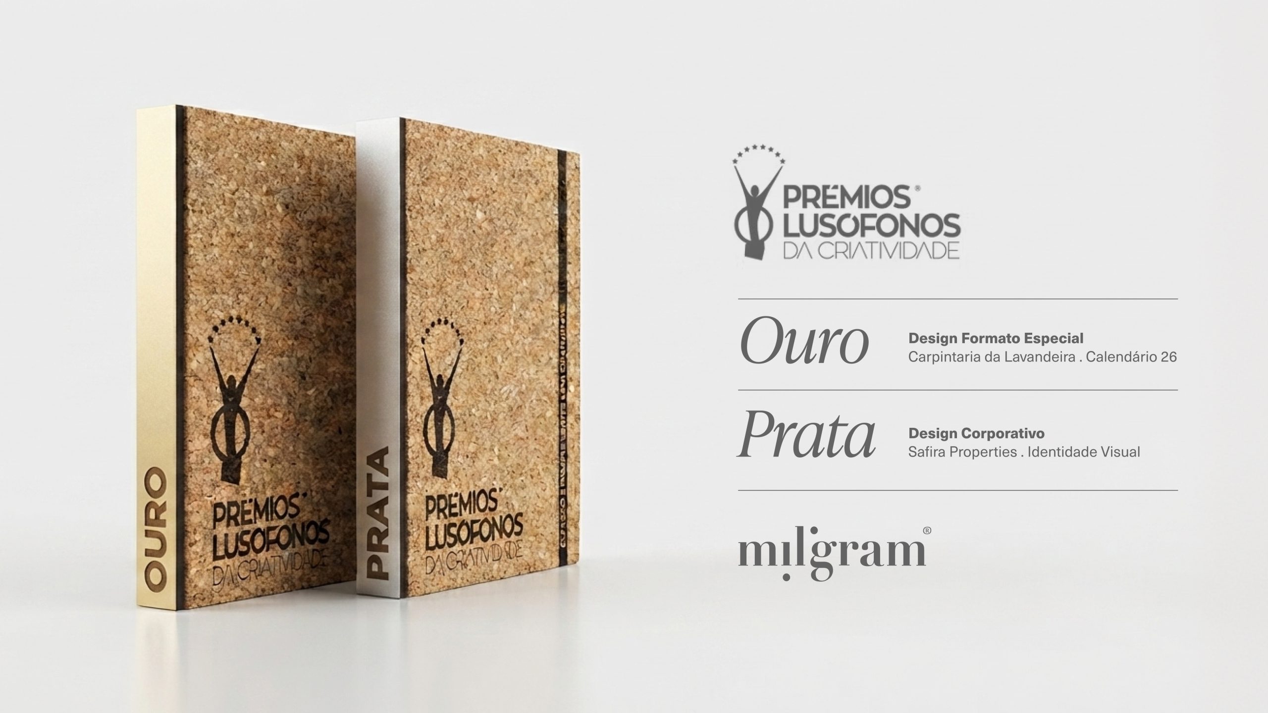
Miligram received two awards at Prémios Lusófonos da Criatividade 2026: Gold for the Carpintaria da Lavandeira Calendar, in the Special Formats category, and Silver for the Safira Properties visual identity.
Two projects entered. Two award-winning projects.
More than the result itself, these distinctions represent the recognition of an approach to thinking and creating that has guided us for over 20 years: understanding each brand in depth, identifying what makes it unique and transforming that essence into a relevant, consistent and lasting idea.
Gold for the Carpintaria da Lavandeira Calendar
To celebrate Carpintaria da Lavandeira’s 20th anniversary, we wanted to create something that reflected its history, savoir-faire and close relationship with its raw materials.
The result was an object that goes far beyond the traditional purpose of a calendar.
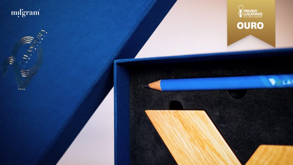
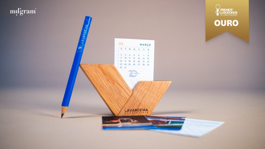
We developed an oak structure shaped around the brand’s identity, designed to hold monthly sheets featuring illustrations of some of Carpintaria da Lavandeira’s most iconic projects. The piece is accompanied by a personalised pencil, connecting it to the manual and artisanal nature of the company’s work.
Every element was designed to form part of a coherent whole. From the selection of materials to the construction of the packaging, featuring hot foil stamping, a fine paper exterior and laser-cut foam inside, designed to hold each object with precision.
The project embodies the brand’s sprezzatura: an apparently effortless elegance, supported by extensive knowledge, technical expertise and attention to detail.
A celebration of time, material and two decades of work, now awarded Gold at the Prémios Lusófonos da Criatividade.
Silver for the Safira Properties identity
The Safira Properties identity was born from a belief about the way we inhabit spaces: every place has an identity of its own.
Based on this idea, we created a visual universe capable of communicating the brand’s positioning in an elegant, solid and distinctive way.
The symbol is formed by two curves held in tension and refers to the gemstone that gives Safira its name: a shape crafted with precision and associated with value and durability.
The typographic combination of Sweet Gothic and Butler creates a balance between character and elegance. The colour palette, composed of Twilight, Ivory and Sand, establishes a subtle connection to the territory without restricting the brand to a specific location or an overly literal visual language.
From the symbol to its various applications, the entire visual system was developed to work with coherence and consistency.
An identity designed to be recognised before it introduces itself, and one that received Silver at Prémios Lusófonos da Criatividade.
Recognition of work created together
Although very different, the two projects share the same approach.
Both were born from close collaboration with our clients, a deep understanding of their stories and a process in which strategy, creativity, design and execution never exist in isolation.
These awards recognise the projects, but also everyone who helped bring them to life: the team who questioned, thought, designed, tested and refined every detail; the partners who helped produce each piece; and, naturally, the clients who trusted Miligram to interpret and shape their brands.
The Gold and Silver awards received at Prémios Lusófonos da Criatividade represent an important milestone in our history. Not as a final destination, but as another reason to continue questioning, experimenting and raising the standard of the work we deliver.
Thank you for your trust, and thank you for the recognition!